


TELEMUNDO
Create new logo ident animation for Telemundo, make the logo look fresh and relevant.
Tools:
Deliverable:
Adobe After Effects
Ident Animation in different ratios
Role:
Concept Design Animation
Research
ABOUT TELEMUNDO
Telemundo, part of NBC Universal Hispanic Group, is the #1 Spanish-language primetime network, reaching 80% of U.S. Hispanics monthly. It offers TV, digital, and international content, including 1000+ hours of original programming, news, sports, and culturally relevant shows for U.S. Latinos, with key markets in Miami, New York, Orlando, and Boston.
For more info on the client, click here
THEIR DESIGN
Red Bee Creative led Telemundo's 2018 (and current) logo rebranding, unifying all sub-brands under the 'T' icon for consistency. The refresh rebranding emphasized a dynamic, impactful identity, reflecting the audience's dual heritage while creating a cleaner look for multiscreen environments.
To view their rebrand on Telemundo, click here
WHO IS THIS FOR?
Telemundo targets Hispanic Americans, dubbed "200%ers" (100% Latino, 100% American), who are typically 12 years younger than English-language TV viewers, prefer live TV and telenovelas, with 28% of their content viewed in Spanish.
Concepts

1
CONCEPT & DESIGN
Simple, complementary colorful squares representing Hispanic American diversity evolve into cultural symbols, like Taino Sun and Venezuelan Cuatro, before revealing the Telemundo logo.

2
CONCEPT & DESIGN
Hints of the Telemundo logo within abstract shapes build anticipation, symbolizing the network’s versatility and unifying presence across diverse media before revealing the full logo.


3
CONCEPT & DESIGN
This concept was chosen.
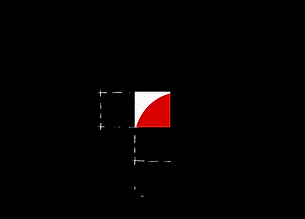
Geometric shapes combined with organic forms before merging into the Telemundo logo, symbolizing the seamless blend of Latino and American cultures that defines Telemundo's identity.
Process
Design Iterations
I realized I was overcomplicating the design and overlooked that most Hispanic Americans trust Telemundo for straightforward and honest news. I wanted to translate that trust into the design and animation by simplifying and emphasizing the interaction between the two cultures.


Final Design
After experimenting with complex 2D and 3D mediums, cluttered backgrounds, and chromatic aberration effects, I chose a light gray gradient to enhance Telemundo's sleek design.


Typography & Colour Palette

Red Bee Creative chose the Foco Bold for Telemundo's logo, aiming for a dynamic and impactful brand identity that conveys constant movement.
I utilized the brand colors of their iconic red and dark slate gray, supported with light gray-white gradient background to maintain its clean, minimalistic look.
Motion Tests
The initial iterations had stiff movement and a messy VHS look from chromatic aberration, clashing with Telemundo’s modern style and soundtrack. This, along with hand-drawn animation through Procreate Dreams and 3D elements from Cinema4D, was removed for simplicity.


The piece shows progress with polished styleframes, cohesive design, and expressive transitions, but the pacing feels rushed and disjointed. Simplifying animations, refining transitions, and cutting scenes will improve clarity and readability without audio.
Final Animation
The animation was polished to sync with the beat, with echoes in the logo complementing the clean soundtrack. It has grown from a cluttered to a subtly intricate piece. Other versions were made with different ratios and shorter.
Credits
Sound Design - Jas Gunarto & Kelly Warner
Music - Universal Production Music